
|
|
 |


|
|
|
|
|
|
|
|
|
|
|
Curious
Gondolin
May 16 2007, 10:33am
Post #1 of 25
(5788 views)
Shortcut
|
|
Tolkien Art Open Discussion, Artists Not Previously Discussed: Pauline Baynes
|
Can't Post
|
|
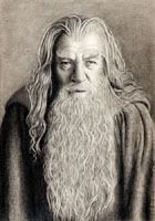
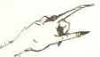
Thanks to Wynnie for the following reproduced images (not the images in the links). The color images are from Bilbo's Last Song, in which Baynes essentially illustrated The Hobbit at the bottom of each page and "The Grey Havens" in the center of each page. Note that the illustrations of The Hobbit are significantly larger here than in Bilbo's Last Song, which is a small book. If you like Baynes' drawings, I highly recommend Bilbo's Last Song. Please do not reproduce these images for any commercial purposes.
Please tell us what you like or dislike about these drawings, and perhaps make some specific comments about your favorites or least favorites.
Here is biographical information about Pauline Baynes:
http://personal.bgsu.edu/~edwards/baynes.html
http://en.wikipedia.org/wiki/Pauline_Baynes
Smith of Wootton Major:

Cat:

Bag End:

Beorn:

The Elvenking:

Smaug on his treasure pile:

Flying Smaug:

Riding Home:

Bilbo rides to the Grey Havens:

Fox (detail):

Merry and Pippin arrive at the Grey Havens:

Sam, Merry, and Pippin at the Grey Havens:

Map with illustrations from The Hobbit:
http://home.agh.edu.pl/...d/Mapy/hobbitmap.jpg
Map with illustrations from LotR:
http://img-fan.theonering.net/...nes/middle-earth.jpg
Tolkien book covers by Baynes:
http://eq5.net/tolkien/tbkcovers.html
Rare LotR slipcase by Baynes:
http://www.tolkienbooks.net/...mages/sc-artwork.jpg
|
|
|
a.s.
Doriath

May 16 2007, 11:13am
Post #2 of 25
(4525 views)
Shortcut
|
I wonder how much of my liking for Baynes' work is wrapped up in the fact that the Narnia books I read over and over as a child featured her illustrations. Even when I look at these, I still think of Narnia.
How ironic Tolkien must find that, up there in his heaven...since he reportedly disliked the Narnia tales so much yet liked Baynes' illustrations!

a.s.
"an seileachan"
Some say they're going to a place called Glory, and I ain't saying it ain't a fact.
But I've heard that I'm on the road to Purgatory, and I don't like the sound of that!
I believe in love, and live my life accordingly,
And I choose: let the mystery be.
~~~~Iris DeMent
|
|
|
Elven
Doriath

May 16 2007, 12:38pm
Post #3 of 25
(4475 views)
Shortcut
|
Theres a sense of innocence with these illustrations - maybe its the colouring or the way they have been drawn - there's a gentleness about them - even the Elven King and the Dwarves in their youthful depiction.
The Smaug illustration wrecking Lake Town ... Im not sure about - its the blue of the water maybe ....
But the rest are lovely - and I especially like the Cat ... Bag End, Smaug and his Treasure, The Fox, and Sam Merry and Pippin at the Grey Havens.
I like the framing of the illustrations in the round too 
Thankyou curious!!
 Elven Elven

SILVERCHAIRS Daniel Johns gets the crowd going at the 'Big Day Out Festival' at Minas Tirith.
"Never wash your name in hot water Elvenesque - it shrinks!" said the Gaffer.
Tolkien was a Capricorn!
..All we are saying ..Is Give Pete A Chance" ...
|
|
|
Reera the Red
Ossiriand
May 16 2007, 1:19pm
Post #4 of 25
(4478 views)
Shortcut
|
|
I know I've seen these before...
[In reply to]
|
Can't Post
|
|
...but I always find that Baynes' pictures make so little impression that I can't remember what they looked like. I just find them undistinctive and not very interesting.
Except for one thing: in the riding to the Grey Havens pic, she's got Galadriel riding an offside sidesaddle. That's unusual enough to stick in my mind.
"People accuse me of being cross, and crabbed, and unsociable, and they are quite right." --Red Reera, the Yookoohoo
|
|
|
Curious
Gondolin
May 16 2007, 2:10pm
Post #6 of 25
(4472 views)
Shortcut
|
|
I should have checked with you first.
[In reply to]
|
Can't Post
|
|
Now I know.
|
|
|
Wynnie
Nargothrond

May 16 2007, 3:02pm
Post #7 of 25
(4472 views)
Shortcut
|
in saying that the Hobbit pictures are relatively small in the book, whichever edition we're talking about. The scans are misleading in that respect, but I wanted to make it easier to see all the lovely little details.

the unbidden guest
|
|
|
drogo
Menegroth

May 16 2007, 3:26pm
Post #8 of 25
(4471 views)
Shortcut
|
It is nice to see the little Hobbit illustrations from Bilbo's Last Song in better detail.
|
|
|
squire
Gondolin

May 16 2007, 3:34pm
Post #9 of 25
(4486 views)
Shortcut
|
|
I like the early line art best
[In reply to]
|
Can't Post
|
|
I don't have access to any just now, but her drawings for Farmer Giles of Ham from the late 1940s, and her Adventures of Tom Bombadil art (c. 1962) and even the first versions of Smith of Wootton Major (c. 1967) are much more charming and naive than the more worked-up or painted images from those Wall Maps and Bilbo's Last Song and what I discovered recently, the second versions of Smith of Wootton Major.
I note that many of the vignettes in the Hobbit Wall Map are lifted closely from Tolkien's pictures - but that the map is LotR's Middle-earth, not the Hobbit's "Wilderland". I suppose Tolkien approved this map, the way he did the LotR map?
When she sticks to line art, I think, she has that retro-Medieval look that captured Tolkien in the first place. Her washed or colored paintings approach a more standard form of "children's illustration" that is less distinctive artistically. I do like the tree-framing device she uses in Bilbo's Last Song; but I don't care for her hobbits. Smaug looks way too much like Chrysophylax - Baynes just can't do "evil", I might guess.
Along those lines, I don't think she has the weight to carry off a convincing series of Lord of the Rings scenes; her lightness and charm seem much more suited to Tolkien's ephemera than to his dark masterpiece.

squire online:
RR Discussions: The Valaquenta, A Shortcut to Mushrooms, and Of Herbs and Stewed Rabbit
Footeramas: The 3rd TORn Reading Room LotR Discussion; and "Tolkien would have LOVED it!"
squiretalk introduces the J.R.R. Tolkien Encyclopedia: A Reader's Diary
|
|
|
Curious
Gondolin
May 16 2007, 5:20pm
Post #10 of 25
(4485 views)
Shortcut
|
|
When you get access, I would love to see your favorites.
[In reply to]
|
Can't Post
|
|
You may be right about Baynes illustrating LotR, let alone The Sil. I think she said somewhere that she didn't much care for LotR. But on the other hand I wish Lee and Nasmith had more of Baynes' and Jansson's whimsy and humor. Cor Blok seems to combine childlike innocence with grim horror, which is one reason I like him. But he's a bit too unconventional and primitive for some, and his paintings, despite their apparent simplicity, are surprisingly grim.
For me what makes LotR great is the way it bridges the gap between the whimsy and humor of The Hobbit and the grim world of The Silmarillion. I have yet to see a Tolkien artist who can consistently do the same. Lee's portrait of Bombadil, Nasmith's drawing of Rivendell, Jansson's drawing of Smaug assaulting Laketown, and Blok's painting of Helm's Deep are individual paintings that come close to my ideal.
|
|
|
Elberbeth
Dor-Lomin

May 16 2007, 8:29pm
Post #11 of 25
(4440 views)
Shortcut
|
and Sam, Merry and Pippin at the Grey Havens -- they look so sad.
"There are some things that it is better to begin than to refuse, even though the end may be dark."
|
|
|
Daughter of Nienna
Hithlum

May 16 2007, 10:44pm
Post #12 of 25
(4443 views)
Shortcut
|
How wonderful!
Thank you Wynnie for scanning these images...and thank you Curious for posting them and for finding all these great Baynes links (all saved for eventual revised art links).
Generally, I'd say her art has grown on me�though I m not overly fond of art that is more like art for Children's literature, like these are. But then there are exceptions for me (see below). When her art rises above children's art into a place of elegance and charm and beauty, those are the ones that grab my heart�especially when keenly emotional moments are captured. The decorative vines and charming animals encircling strongly add that touch of both elegance and charm�and dashes of whimsy, too.
In 'Merry and Pippin arrive at the Grey Havens', I really feel the joy of their arrival in the middle of an extremely sad moment. in 'Sam, Merry, and Pippin at the Grey Havens', I want to weep as they weep. That is good art, when it makes you feel the moment.
Though I enjoy the look of 'Bilbo Rides to the Grey Havens', the content does little for me�It thought it was just a royal hunt of some kind�not the momentous occasion of those leaving Middle-earth.
I don't care for her benign Smaug. The rest are fine�but don't thrill me.
Merry and Pippin arrive at the Grey Havens:
Sam, Merry, and Pippin at the Grey Havens:
Art Gallery Revised, Aloha & Mahalo, Websites Directory
Nienna: � those who hearken to her learn pity, and endurance in hope . . . All those who wait in Mandos cry to her, for she brings strength to the spirit and turns sorrow to wisdom." � Valaquenta
|
|
|
Wynnie
Nargothrond
May 17 2007, 12:42am
Post #13 of 25
(4446 views)
Shortcut
|
I didn't realize that the Smith pictures had been reworked. The one Curious posted above is from a 1994 (orig. 1980) Poems and Stories; here's the version from my old Ballantine paperback (sorry about the print bleeding through):

The most striking difference is Smith's shadow.
I don't have access to any of the older Bombadil art, but here's an illustration from the above-mentioned Poems and Stories (sorry about the shadow on the edge):

And for good measure, a couple of bunnies (sorry I've got no taters to go with them):

the unbidden guest
|
|
|
Wynnie
Nargothrond
May 17 2007, 1:47am
Post #14 of 25
(4443 views)
Shortcut
|
For those who haven't seen Bilbo's Last Song, this will give you a clearer idea of how the book is set up:

a sample page (from the smaller version)
the unbidden guest
|
|
|
Finding Frodo
Dor-Lomin

May 17 2007, 1:54am
Post #15 of 25
(4426 views)
Shortcut
|
All right, there are no cabbages, but I like the Elvenking painting. He's trying to get some answers out of the dwarves and they're all just standing there stubbornly and not saying a word. I also enjoy sly old Smaug sleeping with one eye open on his treasure pile. As others have mentioned, the arrival of Merry and Pippin at the Grey Havens is well done and the fox is delightful just for being there. Bag End is nice -- not much to comment on except that I think the door hinged on the right is the reverse of what I've become accustomed to. I do not like the Beorn illustration. It looks all out of scale or perspective or something, and why are those horses rearing up?
Where's Frodo?
|
|
|
Eowyn of Penns Woods
Doriath

May 17 2007, 4:14am
Post #16 of 25
(4430 views)
Shortcut
|
|
I'm looking at those right now
[In reply to]
|
Can't Post
|
|
in The Tolkien Reader, and I'm not sure how well most of the Bombadil illustrations will scan. The Farmer Giles stuff should be a bit better, though. She really does capture the look of medieval art very well.
|
|
|
Beren IV
Mithlond

May 17 2007, 4:27am
Post #17 of 25
(4432 views)
Shortcut
|
|
Reminds me more of fairy tales
[In reply to]
|
Can't Post
|
|
Baynes' artwork reminds me more of fairy tale artwork - nice, quaint, happy, bright, but she does manage to capture the sadness at the end. I like her Thranduil in particular, although perhaps he is a little too faerie-like.
Once a paleontologist, now a botanist, will be a paleobotanist
|
|
|
squire
Gondolin
May 19 2007, 4:53pm
Post #19 of 25
(5384 views)
Shortcut
|
|
How Pauline Baynes did Smith of Wootton Major twice - 1967 and 1992
[In reply to]
|
Can't Post
|
|
I've managed to pull together the two sets of Pauline Bayne's illustrations for Smith of Wootton Major, the first set from the original edition of 1967, and the second set from the Tolkien anthology of his short works, called Poems and Stories, first published in the UK in 1992 and the US in 1994.
Notice the differences. One of the reasons may be that the first edition was pocket sized, half as big as a regular book. For the anthology, which is full sized (6" x 9"), the original illustrations may have seemed too plain or too simple to fill larger pages. But I think Ms. Bayne's taste had changed, and she felt compelled to shade in or add grey washes to what had originally been ink line drawings. Also - can we say this? - Tolkien was gone and had nothing to say about the "new look".
Here are the frontispieces.

First edition.

from "Poems and Stories". As a unifying device in the anthology, each reprinted selection has a two page Baynes composition. There is always a Tree of a story-appropriate kind on the left page, and a title box on the right, topped by a story-appropriate dwelling, that contains a fully-toned picture of the tale's protagonist.
Here is the picture of the Children's Party. The original spanned two half-size pages (note the pasted together seam in the center); the second was recomposed to fill a single full size page.

First edition.

from "Poems and Stories"
Here is Smith at work in his smithy.
 
First edition. (L) from "Poems and Stories" (R)
Here is Smith exploring the land of Faerie.
 
First edition. (L) from "Poems and Stories" (R)
Here is Smith being terrified by the arrival of the grim, singing, Elven army off the ships.
 
First edition. (L) from "Poems and Stories" (R)
Here is Smith dancing with the Elven folk.
 
First edition. (L) from "Poems and Stories" (R)
Here is Smith with his family as he gets older.
 
First edition. (L) from "Poems and Stories" (R)
Here is Smith walking back to the village with Alf. Again the drawing was recomposed from a half-size two page spread to a single full page.

First edition.

from "Poems and Stories"
Here is the endplate. This is just the original. For the 1992 anthology, the hearthside vignette appeared by itself on the right page opposite the last page of text.

First edition.
In looking through the 1992 "Poems and Stories" (which is well worth owning, by the way, as a kind of alternative to the "Tolkien Reader"), I see that every single one of Baynes' illustrations from the 1947 Farmer Giles of Ham was kept (rather than being redrawn to a new scale, because the pictures sit in line in the text) but each was basically "touched up" by Baynes, with the addition of shading of various degrees. She also drew two new original full page illustrations for the new printing of Farmer Giles: one of Chrysophylax in the village negotiating; and one of him scattering the knights. The style is quite different from the line drawings - and not nearly as pleasing to the eye, as far as I'm concerned. But that's possibly the subject of a different post.
I'll just add that Baynes also illustrated "Leaf by Niggle" with the frontispiece following the scheme described above, a full page drawing of Niggle discovering his tree, and endplate of the fragmentary "Leaf" painting, framed in the museum. Again, no time for that now.
squire online:
RR Discussions: The Valaquenta, A Shortcut to Mushrooms, and Of Herbs and Stewed Rabbit
Footeramas: The 3rd TORn Reading Room LotR Discussion; and "Tolkien would have LOVED it!"
squiretalk introduces the J.R.R. Tolkien Encyclopedia: A Reader's Diary
|
|
|
WonderBroad
Menegroth

May 19 2007, 6:37pm
Post #21 of 25
(4410 views)
Shortcut
|
Pauline Baynes's work is an inspiration, and I'm glad it was posted here.
|
|
|
dernwyn
Forum Admin
/ Moderator

May 20 2007, 11:56pm
Post #22 of 25
(4420 views)
Shortcut
|
|
Excellent! Thank you for this comparison!
[In reply to]
|
Can't Post
|
|
I had not seen the newer drawings before. Yes, the older line sketches are superior, with their "Bayeaux Tapestry" style; they seem more expressive than the shortened and shaded newer ones, which seem "ordinary" in comparison.
I can understand an artist's personal taste changing over the years, but I do like the "earlier" Baynes better.
~~~~~~~~~~~~~~~~~~~~~~~~~~~~~~
"History often resembles "Myth", because they are both ultimately of the same stuff."
|
|
|
N.E. Brigand
Gondolin

May 21 2007, 12:08am
Post #23 of 25
(4405 views)
Shortcut
|
~~~~~~~~~~~~~~~~~~~~~~~~~~~~~
 Tolkien Illustrated! Jan. 29-May 20: Visit the Reading Room to discuss art by John Howe, Alan Lee, Ted Nasmith and others, including Tolkien himself. Tolkien Illustrated! Jan. 29-May 20: Visit the Reading Room to discuss art by John Howe, Alan Lee, Ted Nasmith and others, including Tolkien himself.
May 14-20: Open Discussion!
|
|
|
Curious
Gondolin
May 21 2007, 8:59am
Post #24 of 25
(4411 views)
Shortcut
|
|
Thank you. I hope you find time for that follow-up
[In reply to]
|
Can't Post
|
|
post comparing and contrasting the two sets of illustrations. Many of the illustrations seem very similar. I prefer the two-page illustrations to the one-page versions, but that has little to do with the content of the illustrations. The two illustrations that change the most in content are those of the Elven armies disembarking from their ships and of Smith's shadow as observed by his son.
The two pictures of the Elven armies are almost completely different illustrations. In the first the Elves all look alike and are about to trample poor Smith, or so it appears. The second version is more three dimensional and realistic, but perhaps less startling and also less symmetrical. I think I like the emotion of the first drawing better -- I can understand why Smith would feel terrified -- but that doesn't mean I dislike the more realistic treatment.
The pair of pictures featuring Smith's shadow are very similar in composition, but different in shading. Again, the second picture is more realistic, but this time the difference is more subtle. The characters are basically the same, but shading is added to the second picture, and the shadow of Smith is far more subtle. In both pictures I wonder what light source creates the shadow, since the fire is behind the figures in the picture. The shadow in the first picture is far less subtle, but perhaps more pleasing to my eye. Again, though, I don't dislike the more subtle and realistic treatment in the second version.
Bottom line: I don't see enough difference between the two versions to say I like the first and dislike the second. In general I like both sets of illustrations, as well as Baynes' other Tolkien illustrations, because they have a quality I associate with fairy tales, and do not see in the pictures of Lee, Howe, and Nasmith, but do see in the pictures of Blok and Jansson as well as Baynes. Baynes' pictures may not be grim enough for The Silmarillion or even for the latter part of LotR, but I think if she had tried to illustrate LotR she might have carried it off. I don't think of LotR as a particularly grim tale, myself. And even where it might be considered grim, I like the idea of illustrating it as a fairy tale, and not as a novel.
|
|
|
Aunt Dora Baggins
Elvenhome

May 21 2007, 11:13am
Post #25 of 25
(4429 views)
Shortcut
|
|
That reminds me of how she came back to her Narnia illustrations
[In reply to]
|
Can't Post
|
|
and colored them just recently, after about fifty years had elapsed. What an amazing woman she must be.
~~~~~~~~~~~~~~~~~~~~~~~~~~~~~~~~~~~~~~~~~~~~~~
"For DORA BAGGINS in memory of a LONG correspondence, with love from Bilbo; on a large wastebasket. Dora was Drogo's sister, and the eldest surviving female relative of Bilbo and Frodo; she was ninety-nine, and had written reams of good advice for more than half a century."
~~~~~~~~~~~~~~~~~~~~~~~~~~~~~~~~~~~~~~~~~~~~~~
Chance Meeting at Rivendell: a Tolkien Fanfic
and some other stuff I wrote...
leleni at hotmail dot com
~~~~~~~~~~~~~~~~~~~~~~~~~~~~~~~~~~~~~~~~~~~~~~
|
|
|
|
|