|
|
 |


|
|
|
|
|
|
|
|
|
|
|
Altaira
Superuser

Apr 6 2007, 3:59am
Post #1 of 8
(1381 views)
Shortcut
|
|
Tolkien Illustrated: Ted Nasmith #9 – The Return of the King I
|
Can't Post
|
|
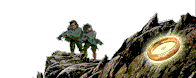
Ted’s body of work on the Return of the King gives us an opportunity to do a few more comparisons of paintings that depict the same subject matter.
This painting first appeared in the 1992 calendar, then again on a Danbury Mint plate:

Eowyn and the Lord of the Nazgul; tednasmith.com
Notice the riderless and confused horses in the background on the right. Notice something crawling through the grass in the lower left? 
This one first appeared on a Danbury Mint plate, then again in the 2004 Tolkien/Return of the King calendar:

Eowyn and the Nazgul; tednasmith.com
In this picture we don’t see as many details of the battle. We’re below the action looking up at the Witch King and the fell beast, making them appear large and imposing.
Question 1: IMHO, the first painting depicts more detail and accuracy - I find a new detail every time I look at it. The second has more of an emotional impact. I see (and feel) how big the fell beast and Witch King must look to Eowyn and Pippin. What are some of the other differences in these two pictures and how do they affect you?
Here’s another nice pair of paintings depicting Eowyn and Faramir.
The first one appeared on a Danbury Mint plate in 1995

The Sun Unveiled; tednasmith.com
This is another great pic for details. Look for the smoking burned items (siege towers?) on the plain and the sails of ships docked on the banks of the Anduin. While fun to look at, the small details don’t detract from Eowyn and Faramir with the light falling on them. Love the embrace.
The next appeared in the 2004 calendar

Eowyn and Faramir; tednasmith.com
This is a much more stylized, almost cartoon/graphic novel approach. Though embracing, both characters appear both intense and courageous as they face what they’re looking at in the distance.
Question 2: What do you like and dislike about these two very different approaches to the same subject?
Question 3: For the most part, Ted seems to be able to work equally well with a very realistic approach, (especially with landscapes), as with a more stylized approach. The decision as to which to use may be influenced by the audience, but in the end, it lies with the artist. Sometimes, as with the pictures of Eowyn and Faramir, the artist decided to take different approaches with the same subject; the ‘game’ he talked about in an earlier quote. Is this a strength from the perspective of a fan of Tolkien art? Whether you prefer one or the other, can you appreciate both?

Koru: Maori symbol representing a fern frond as it opens. The koru reaches towards the light, striving for perfection, encouraging new, positive beginnings.
"All we have to decide is what to do with the boards that are given to us"
"I take a moment to fervently hope that the camaradarie and just plain old fun I found at TORn will never end" -- LOTR_nutcase
TORn Calendar
|
|
|
Curious
Half-elven
Apr 6 2007, 11:25am
Post #2 of 8
(1251 views)
Shortcut
|
|
Nasmith just isn't that good with portraits.
[In reply to]
|
Can't Post
|
|
I must confess I'm not that familiar with Tolkien illustrators after the Hildebrandts (i.e. after my college days). I was impressed with Lee's artistic skills, but really wished he would use more color and expression and take more risks with his subject matter. Nasmith does all the things I wish Lee would do, but unfortunately doesn't have Lee's skills, especially when it comes to portraits.
And sometimes, as with his drawings of the Witch-king, Nasmith's gambles don't pay off. Nasmith is following Tolkien to the letter when he shows the Witch-king's crown on an invisible head, but unfortunately to me it looks a bit silly. He also has trouble with Eowyn's face. Nasmith's take on the fell beast is certainly ugly, but also seems ungainly, like a baby bird before it gets its feathers and its balance.
As for the drawings of Eowyn and Faramir, I like everything except the faces. The faces in the first version are better, simply because they are smaller; in the second version Faramir's face is pretty good, although unexpressive, but there's something wrong with Eowyn.
Sorry, no time for more, but I must say again I've been impressed with Nasmith so far. I wish I could combine Lee's drawing skills with Nasmith's color and light and contrast and gambling temperment, then put them under the personal direction of Tolkien. I can hardly wait to see Howe.
|
|
|
mae govannen
Tol Eressea
Apr 6 2007, 12:58pm
Post #3 of 8
(1230 views)
Shortcut
|
|
Witch-King not at all impressive for me:
[In reply to]
|
Can't Post
|
|
the massive, strong being of the film, with his huge heavy mace, works better for me. Even Eowyn is somewhat too elongated, and looks expressionless..
Everything around them is a bit too gracile as well, they aren't fleshy enough somehow, everything looks wiry in that first painting; quite strange. The battlefield looks almost empty because of that. PJ's battles are for me much more real looking and scary.
The two 'Éowyn and Faramir 'convey more emotionally than the two paintings before, but still, although they are both beautiful, they fail to touch me, I couldn't say why. Too statuesque, perhaps???
'Is everything sad going to come untrue?'
(Sam, 'The Field of Cormallen', in 'The Return of the King'.)
|
|
|
OhioHobbit
Gondor
Apr 7 2007, 8:34pm
Post #5 of 8
(1203 views)
Shortcut
|
|
Ted Nasmith's paintings are fantastic.
[In reply to]
|
Can't Post
|
|
If only he would leave the people out.
Eowyn and the Lord of the Nazgul looks like something from a story book. I don't think that I would recognize it as a Nasmith, but I like it as a story book sort of painting.
Eowyn and the Nazgul looks like the cover of a paperback. I don't care fore it, not that there aren't some good paperback covers.
The Sun Unveiled I like for it's light. The black sky, the sun on the walls, Eowyn's white dress against Faramir's dark robes.
With Eowyn and Faramir its the colors, especially Eowyn's cape. I try to not look at the faces.
|
|
|
Morwen
Rohan

Apr 7 2007, 9:34pm
Post #6 of 8
(1202 views)
Shortcut
|
The first Čowyn/Witch-king just doesn't work for me. Lots of detail but not enough impact for this very dramatic moment. It's a little like a jigsaw, all the pieces are there, but the whole doesn't give me the feeling of the Nazgul's overwhelming presence or of Čowyn's desperation. The second picture, with less detail and more focus on Čowyn and the Witch-King, seems much stronger.
I like both the paintings of Čowyn and Faramir. In the first, I love the way Čowyn and Faramir's tender embrace contrasts with the dark sky and grim details in the background. Two lovers standing in the light, against the dark. I admit I like the second painting partly because it shows Faramir's mother's blue cloak, and Čowyn does look "fair and queenly" in it, just as described. It doesn't catch the moment for me as well as the first picture, but I like being able to see the nobility and courage in their faces. I like embrace in this one, too. It seems like Nasmith understands how to show tenderness and intimacy.
I wish you could have been there
When she opened up the door
And looked me in the face
Like she never did before
I felt about as welcome
As a Wal-Mart Superstore--John Prine
|
|
|
Beren IV
Gondor

Apr 8 2007, 1:06am
Post #7 of 8
(1204 views)
Shortcut
|
|
I agree: Nasmith is a landscape artist
[In reply to]
|
Can't Post
|
|
Why do we keep confusing him with Alan Lee? 
The second image of Eowyn against the Witch-King, while the Witch-King is still mounted on his wyvern, is the one of these I like best and really the only one I like. The others have the characters in still postures, and odd body proportions, especially odd facial proportions. The wyvern is nice, probably the nicest thing of the entire painting, but the rest of the characters don't look so great.
Once a paleontologist, now a botanist, will be a paleobotanist
|
|
|
Daughter of Nienna
Grey Havens

Apr 9 2007, 5:13am
Post #8 of 8
(1238 views)
Shortcut
|

Eowyn and the Lord of the Nazgul
Question 1: What are some of the other differences in these two pictures and how do they affect you?
The only things I can see these 2 paintings have in common, is the subject and the artist. Compositionally, despite the using triangles used in the composition of #1, it still feels 'flat' because we the viewer are on the same plane as both Éowyn & the Nazgűl . . . that squares us off with them. The result is a loss of energy and a less dynamic composition.
Plus: in #1, the Nazgűl appears more like a spindly-bow-legged Haradrim than an invisible Nazgűl. And, I think he should be towering over Éowyn — who's legs wouldn't be bare, btw. Yet, at the same time I have a hard time looking away from this Nazgűl, there is something intriguing, wrong (imo), but that 'wrong' is still interesting to look at…he is kind of pointy isn't he.
Despite the problems I see in the portrayal of the subject, I do enjoy this painting, in part because of the reasons you gave: the amount of detail surrounding the central subjects. I love the analogous (colors next to each other on the wheel) color scheme of blues and greens that are cool overall (#2 is warm overall). And the grimness of the portrayal of the battle destruction …especially Merry.

Eowyn and the Nazgul
In the image #2:
Regarding Composition:
The composition is far more dynamic. I agree that it does carry a far more of an emotional impact. The composition has a lot to do with that as well as the color. In this image, the viewer is set below the plane of the action and at an off-angle because of the hill in the scene…giving the added feel that the earth is slightly tilted increasing the danger element.
There is great mastery in how the viewer's eye is directed in this image (from Éowyn to the Nazgűl, down the beasts back around his tail down to Merry who is looking at Éowyn). The way in which the elements are arranged on the page employs a much stronger use of triangles than the first image (and the Hildebradt's on this same subject). There is also unity and balance along with wonderful use of contrast in the composition.
Regarding Colour:
The use of complimentary colors is commonly used to increase tension. Yellow-gold & purple is used in this case (is my favorite set complimentary colors to use). Yellow is naturally light (the lightest) and purple (violet) is naturally dark (the darkest) on the color spectrum. Consequently, there is contrast on several levels within the color scheme, one of hue and one of value . . . and also one of intensity, all three properties of color (= HVI [Hue, Value, Intensity] or HBS [Hue, Brightness, Saturation]). The yellow-gold pops, lights up the image with intensity set against the darker violet, which is slightly grayed out (intensity dialed-down) but that also adds contrast to the highly intense hot colors of yellow gold and orange, something for them to play against which increases the intensity and the tension, and adds to the darkness of the situation.
The color scheme also employs the use of a Split Complimentary to the violet which is the more orange-ish colour (orange being analogous to the yellow makes it a split-comp to the violet).
"Using split complementary colours can give… a high degree of contrast, not as extreme as a real complementary colour. It also results in greater harmony than the use of the direct complementary." So using both provides the great tension and contrast but adding the split adds that extra something that can rub the visual pleasure center and, to me, does so here.
Regarding Content:
The Nazgűl on his Fell Beast are towering above Éowyn ready for attack. Being in the air gives him the "high ground", which increases the power position of the Nazgűl — as does the fact that he is on a movable and explicitly dangerous creature all spelling out impending doom for Éowyn. And she stands 'tall' (figuratively, not overly in this image) and strong, facing the danger steadfastly. Merry looks about to make some kind of move though his opportunity is not yet presented itself. No one is stagnant, all elements seem in motion, even the environment and the earth.
Question 2: What do you like and dislike about these two very different approaches to the same subject?
Answer: I like both of these images, though I do wish he did better with Éowyn's face in #2, I like this one better than #1. It is more alive to me. I don't see it as 'cartoonish' at all. 'Cartoonish', to me, has more spaces of 'flat color'…not as shaded or depicting volume…and having edges drawn by lines (think Ben & Jerry cartoons or Bugs Bunny or the Sunday funnies).
Question 3: the ‘game’ he talked about in an earlier quote. Is this a strength from the perspective of a fan of Tolkien art? Whether you prefer one or the other, can you appreciate both?
Answer: I am not sure where that quote is so I find it hard to respond to that specifically. I do think it a strength for an artist to find different perspectives as a 'fan of Tolkien art'. It is like taking tons of photographs to find the two or three that really come alive and work. And, the more you explore a specific subject, the more your are apt to dig down below the surface to find that inner essence, that spark that makes it come alive.
…
Art Gallery Revised, my drawings,
Aloha & Mahalo, Websites Directory
Nienna: “ those who hearken to her learn pity, and endurance in hope . . . All those who wait in Mandos cry to her, for she brings strength to the spirit and turns sorrow to wisdom." — Valaquenta
|
|
|
|
|